5 Great Dental Websites
Here at Dental Focus, we like to celebrate the fantastic websites we create that are a product of the collaboration with our equally fantastic clients. Take a look at these 5 great dental websites to see for yourself.
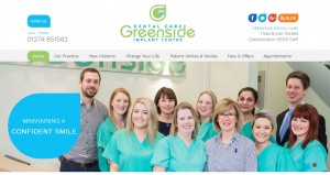
http://www.greensidedental.co.uk/
Greenside Dental Care is a modern family dental practice in Cleckheaton, Bradford. They welcome new patients for general, restorative, preventative and cosmetic dentistry, as well as for more complex procedures such as the placement of dental implants.
Their website is beautifully clean and easy to navigate, providing great user experience. From their stylish logo to the dental website’s colour scheme, every aspect of the design complements their branding and ensures the patient feels relaxed and welcome.
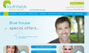
http://www.southfieldsdental.co.uk/
Another fantastic dental website that uses the practice’s existing branding and colour schemes to create an immersive user experience that is like walking into their waiting room. The use of house iconography, greens and blues is subtle yet engaging. The website also offers a whole host of great ways for the patient to get in touch, such as online booking, email forms, social media and more.
Southfields Dental Centre also has a great collection of visuals on their homepage, showing off their friendly team alongside their numerous treatments.
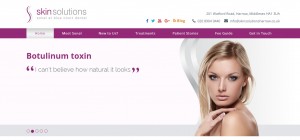
http://www.skinsolutionsharrow.co.uk/
This facial aesthetics website oozes elegance, with a minimalist colour scheme and a range of beautiful stock models. The site contains an excellent range of content about different skin treatments, offering patients a fantastic space to explore the options available and the results it has achieved.
Some of the leading skincare brands also feature on this website, revealing the highly professional reputation of the Skin Solutions team, who are based in Harrow.
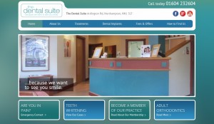
http://www.thedentalsuite.co.uk/
With the tagline, “…because we want to see you smile.” this simple but effective website from The Dental Suite, based in Northampton, is putting the patient at the front of everything they do. The user experience is fluid, with plenty of calls to action, whilst the horizontal navigation keeps the patient in constant touch with all that the practice has to offer.
The main image on the homepage is of the reception desk, giving the patient the feeling of actually walking into the practice from the street, which is a brilliant technique.
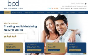
http://www.bluecourtdental.com/
There is a stunning colour scheme of dark blue and gold on this dental website. The site is loaded with lots of useful information regarding treatments, and there is also a good amount of ways that patients can get in touch.
Blue Court Dental also utilise their patient testimonials well to add emotion to the user experience, offering patients a chance to glimpse the patient journey, and the potentially life changing results that can be achieved.
Come back next time for more fantastic dental websites.